7 Elements of High-Quality Signage
When it comes to retail, the saying “first impressions last” rings true. Signage is often the first point of contact a potential customer has with your store, making its design central to your business plan. While it might seem straightforward, there are numerous aesthetic and functional factors to consider.
Types of Signage
Before diving into the nitty-gritty, let’s explore some of the commonly used signage in a retail environment:
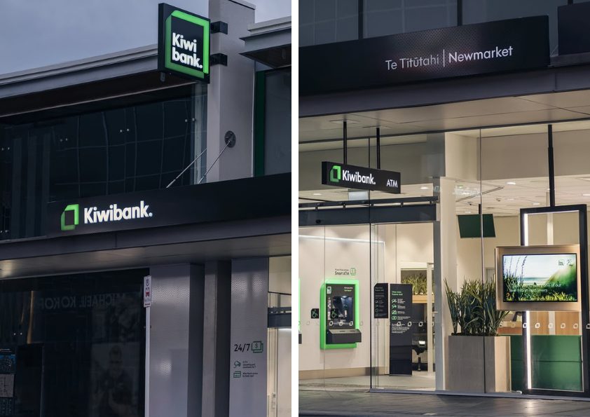
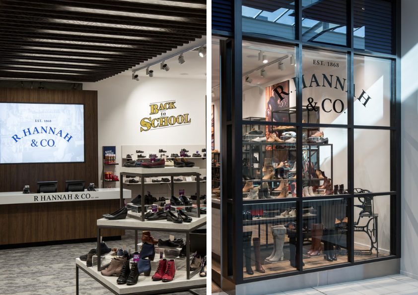
Storefront Signs: This primary signage includes your business name and logo, along with any window displays. It’s arguably the most vital decision, as it draws people in from the street.
Wayfinding Signs: These help customers navigate the store layout, directing them to various product categories or specific items.
Promotional Signs: Generally large banners hanging from ceilings or mounted on walls that showcase sales, special promotions, or limited-time offers.
Point-of-Purchase (POP) Displays: Strategically positioned signs near the checkout area to promote impulse buys or highlight new items.
Informational Signs: These are more detail-heavy signs such as store policies, operating hours, return policies, or loyalty programmes.
Digital Signs: Growing in popularity, these versatile, cost-effective, and sustainable alternatives to plastic and paper allow for dynamic content changes. Digital signage solutions like RD ShopCast+ offer the flexibility to update content without the need for a full overhaul.
Key Elements of a Quality Sign
Every sign in your store serves as a silent ambassador for your brand, influencing customer perception and behaviour. Below are some essential features and best practices to inform your next design.
Visibility and Legibility
This is paramount! Your sign is competing with a lot of noise, including other signs, lighting, building colours, and even passing traffic. Therefore, it should be easily readable at a glance. Key factors include:
Size: Make sure you have chosen a size that is appropriate for the distance you expect it to be viewed from. Consider where it will be located and what obstacles may be in the way.
Font: Opt for clean and easily readable fonts like Calibri or Cambria rather than overly stylised alternatives. Most professional fonts have varying weights, ranging from regular to bold to extended – use these to your advantage by giving priority to certain parts of your message. As a general rule of thumb, never use more than two fonts in a single design.
Contrast and Colour: It’s crucial to ensure a strong contrast between the text (or logo) and the background. For instance, using light text on a dark backdrop or vice versa The colour palette you choose can also evoke immediate emotional responses, whether positive or negative. Numerous studies have explored colour psychology, providing valuable insights to help inform your selections.
Less is More: The most effective sign is simple. If there’s too much clutter, passersby won’t know what you’re selling. White space (can be white or colour), is a must. Aim for 30-40% white space to maintain clarity.
Lighting: Choosing illuminated signs, such as backlit options, serves as an advertisement even outside operating hours.

Illuminated signage guarantees visibility around the clock.
Durability and Longevity
A high-quality sign should withstand the test of time. Utilise robust materials like weather-resistant plastics, metals, or treated woods to resist elements like rain and UV exposure. This upfront investment will pay off in the long run.
Sign Placement
The location of your signage is just as critical as its design. Consider the viewing angles at various speeds and heights, whether from a car, bicycle, or footpath. In fast-paced environments, concise and bold messaging is even more crucial.
Production Quality
Poorly crafted signage can reflect negatively on your brand. Signage specialists utilise specific templates and will flag aspects you might have overlooked.
Consistency
Your signage must align with your overall branding, including mailers, social media posts, and billboards. If your signage looks different from your store or website, it won’t trigger any brand recognition.

Consistency across platforms is crucial for building familiarity and engagement.
Repairs and Maintenance
Regularly inspect for wear and tear as damaged signs can pose safety risks. Bear in mind, the sign you start with, probably won’t be the same sign in five years’ time. While it can be a balancing act between retaining brand identity, repairs and maintenance are also an opportunity to ensure your store stays fresh.
Perspective
Every few months, take a step back and look at your business through the eyes of the customer. Observe how it appears throughout the day and under different lighting conditions, even during closed hours.
Successful signage requires a multidisciplinary team with a deep understanding of design methods and the retail landscape. Valuable advertising space can be squandered with a bad design. That’s why the safest bet is to go with an experienced team with a proven track record. Talk to us today to learn more.